Why Your Camera's Histogram Is the Most Honest Tool You Own

Professional photographers trash about 25% of their shots due to exposure issues — and that's among people who know what they're doing. Beginners? The number climbs closer to 60%. The culprit isn't bad luck or expensive gear. It's trusting your eyes when you should be trusting data. Your camera's LCD screen lies to you. It looks bright in sunlight, dim in shade, and "good enough" rarely is. The histogram — that jagged mountain range buried in your playback menu — is the only thing telling the truth about your image.
This guide walks through exactly what histograms measure, why they matter more than your preview screen, and how to read them in the field to nail exposure every single time. No math degree required.
What Is a Histogram Actually Showing Me?
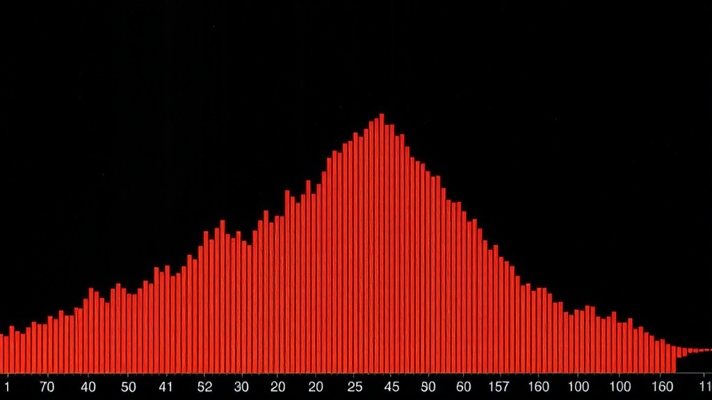
A histogram is simply a graph of brightness values across your entire image. The left side represents pure black. The right side represents pure white. Everything in between — shadows, midtones, highlights — fills the middle. The height of each "mountain" tells you how many pixels in your photo have that specific brightness level.
Think of it like a census for light. A tall spike on the left means lots of dark pixels — maybe you shot a silhouette or underexposed scene. A bulge on the right suggests bright areas — snow, white walls, or overexposed sky. A balanced scene typically shows a bell curve somewhere in the middle, though "balanced" depends entirely on what you're photographing.
Here's the part most tutorials skip: histograms don't care about color. They measure luminance — brightness regardless of hue. That sunset with brilliant oranges and deep purples? The histogram sees it as a collection of light values, not a pretty scene. This objectivity is exactly why it's valuable. Your brain gets distracted by colors and composition. The histogram only sees exposure.
Most cameras display separate RGB histograms if you dig into the menus. These show red, green, and blue channels independently. They're useful for detecting color clipping — when one channel blows out before the others (common with bright reds in digital sensors). For general shooting, the luminance histogram does the heavy lifting.
Why Does My LCD Preview Look Different?
Camera screens are small, bright, and affected by ambient light. Reviewing shots at noon on a beach? Everything looks dark. Checking images in a dark room? They seem brighter than reality. The histogram exists in a controlled mathematical space — unaffected by sunglasses, screen brightness settings, or whether you're squinting.
There's another problem: JPEG preview vs. RAW reality. Your camera shows you a JPEG processed with default contrast and saturation — even when shooting RAW. That dark, moody preview might contain plenty of recoverable shadow detail. The only way to know is checking the histogram. If the graph doesn't slam into the left edge, you've got data to work with.
Some photographers disable the image preview entirely and shoot by histogram alone. It's not as crazy as it sounds. Once you learn to read the graph, you can judge exposure faster than studying a 3-inch screen. Sports and wedding shooters — people who can't miss moments — often work this way.
Modern mirrorless cameras offer live histograms in the electronic viewfinder. This changes everything. You see exposure shift in real-time as you adjust aperture, shutter speed, or ISO. It's like having a light meter that understands your entire scene, not just a single point. If your camera has this feature, turn it on immediately. It lives in the display or viewfinder menu, usually labeled "Live Histogram" or "Exposure Simulation."
How Do I Know If My Histogram Is "Correct"?
There's no universal "perfect" histogram — and anyone who tells you to aim for a bell curve in the center is giving bad advice. The right histogram matches your creative intent. A properly exposed high-key portrait (bright, airy, lots of white) should spike heavily on the right side. A moody noir street scene belongs anchored to the left. The graph simply confirms you achieved what you intended.
That said, there are warning signs. A histogram smashed against either edge means data loss — pure black with no detail (left edge) or pure white with no detail (right edge). Small spikes at the edges are fine for specular highlights (sun reflections, light bulbs) or intentional silhouettes. But broad walls touching the edges suggest you need to adjust exposure.
For most scenes — portraits, landscapes, street photography — you want the bulk of the histogram floating between the edges with breathing room on both sides. This gives you maximum flexibility in editing. It's called "exposing to the right" — pushing the histogram as far right as possible without clipping highlights. Digital sensors capture more tonal information in bright areas than dark ones. A slightly bright exposure pulled down in post looks cleaner than a dark exposure brightened.
Bracketing helps when you're unsure. Shoot one frame at your best guess, one darker, one brighter. Check the histograms later and learn which interpretation worked. Over time, you'll calibrate your eye to the camera's sensor.
Reading Histograms in Tricky Lighting
High-contrast scenes — sunsets, backlit windows, stage performances — break simple histogram rules. The graph stretches across the entire frame with tall peaks at both ends. This isn't wrong. It's accurate. The question becomes: which end can you afford to lose?
Generally, protect your highlights. Blown highlights are unrecoverable in digital photography — once a pixel hits pure white, there's no data to pull back. Shadows, conversely, can often be lifted several stops (though with increased noise). When faced with impossible dynamic range, expose for the brightest important detail and let shadows fall where they may.
Graduated neutral density filters help balance extreme contrast. These darkened pieces of glass go darker at the top and clear at the bottom — perfect for darkening bright skies while preserving foreground exposure. They physically shift your histogram left in the bright areas, buying you a few stops of headroom.
For more on exposure techniques, Cambridge in Colour offers an excellent technical breakdown of how digital sensors handle light.
When Should I Ignore the Histogram Entirely?
Never completely — but sometimes partially. Creative exposure choices trump technical perfection. Intentional silhouettes, blown-out backgrounds for separation, or crushed blacks for mood are all valid. The histogram still reports what's happening; you simply choose to push it to extremes.
Some photographers shoot scenes that will never produce "good" histograms — fireworks, lightning, astrophotography. These rely on timing, long exposures, and post-processing rather than single-frame perfection. The histogram helps you avoid complete disaster (total black frames or entirely blown highlights), but it won't look like a textbook bell curve.
Film shooters working with digital cameras as light meters face another consideration. Film handles overexposure gracefully and underexposure poorly — the opposite of digital. If you're metering for film with a digital camera, expose differently than the histogram suggests. Push those highlights further right than feels comfortable.
Street photographers working fast often have no time for histogram review. The skill here is pre-visualizing exposure before raising the camera. Set manual settings for your expected lighting, take a test shot, check the histogram, then shoot freely knowing your base exposure is solid. This is how Cartier-Bresson would have shot digital — not chimping every frame, but metering once and trusting technique.
Building the Histogram Habit
Start every shoot by checking your playback histogram after the first few frames. Not the image — the graph. Do this until it becomes automatic, about two weeks of consistent shooting. Eventually you'll sense exposure problems before they happen.
Review histograms of your favorite images — both your own and professionals you admire. Notice how different genres produce different signature graphs. Fashion editorials often cluster right (bright, clean). Documentary work spreads wider (harsh reality lighting). Fine art black and white might show dramatic gaps (extreme contrast choices).
Most editing software displays histograms too. Compare your in-camera graph to the processed result. This feedback loop teaches you how much latitude your RAW files actually contain. You'll discover that cameras are more forgiving than they appear — those slightly "wrong" histograms often clean up beautifully.
For deeper technical understanding, DPReview's exposure series covers the relationship between aperture, shutter, ISO, and histogram shape.
Practical Field Techniques
Here's a workflow that works: Set your camera to display the histogram immediately after each shot. Take a test frame. Glance at the graph — not the picture. Is anything hitting the edges? If yes, adjust exposure compensation and shoot again. Two seconds. Done.
Enable "highlight alert" or "blinkies" if your camera offers it. This flashes overexposed areas on playback — a quick visual complement to the histogram. Some photographers prefer blinkies for speed; others find them distracting. Try both.
In manual mode, watch how the histogram moves as you adjust the exposure triangle. Opening aperture (lower f-number) pushes the graph right. Faster shutter speeds pull it left. Higher ISO shifts right but adds noise (visible as a wider, messier graph). These relationships become intuitive with practice.
Back-button focus helps here too. Separating focus from exposure lock means you can meter one area, recompose, and shoot without the camera "helping" by changing exposure. This is critical for backlit subjects where you want the person's face properly exposed, not the bright window behind them.
For metering modes, evaluative/matrix metering works well for most scenes but can be fooled by bright backgrounds. Spot metering lets you read specific areas — place the spot on a midtone (green grass, blue sky, gray card) and expose for that. The histogram confirms whether your spot choice was actually middle gray or deceived by unusual color.
Adobe's guide to histograms in Lightroom connects in-camera capture to post-processing workflow, showing how the same graph concepts apply throughout your imaging pipeline.
The histogram isn't a creativity tool — it's a reality check. It won't tell you what to photograph or how to compose. But it will tell you whether your technical execution matches your vision. In a medium where you only get one chance to capture most moments (ask any wedding photographer about missed first kisses), that honesty is invaluable. Learn to read the graph, trust the data over your eyes, and spend less time fixing mistakes and more time making photographs.